

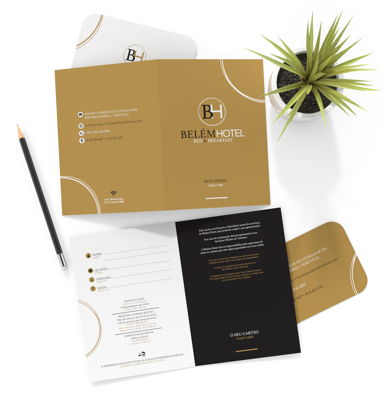

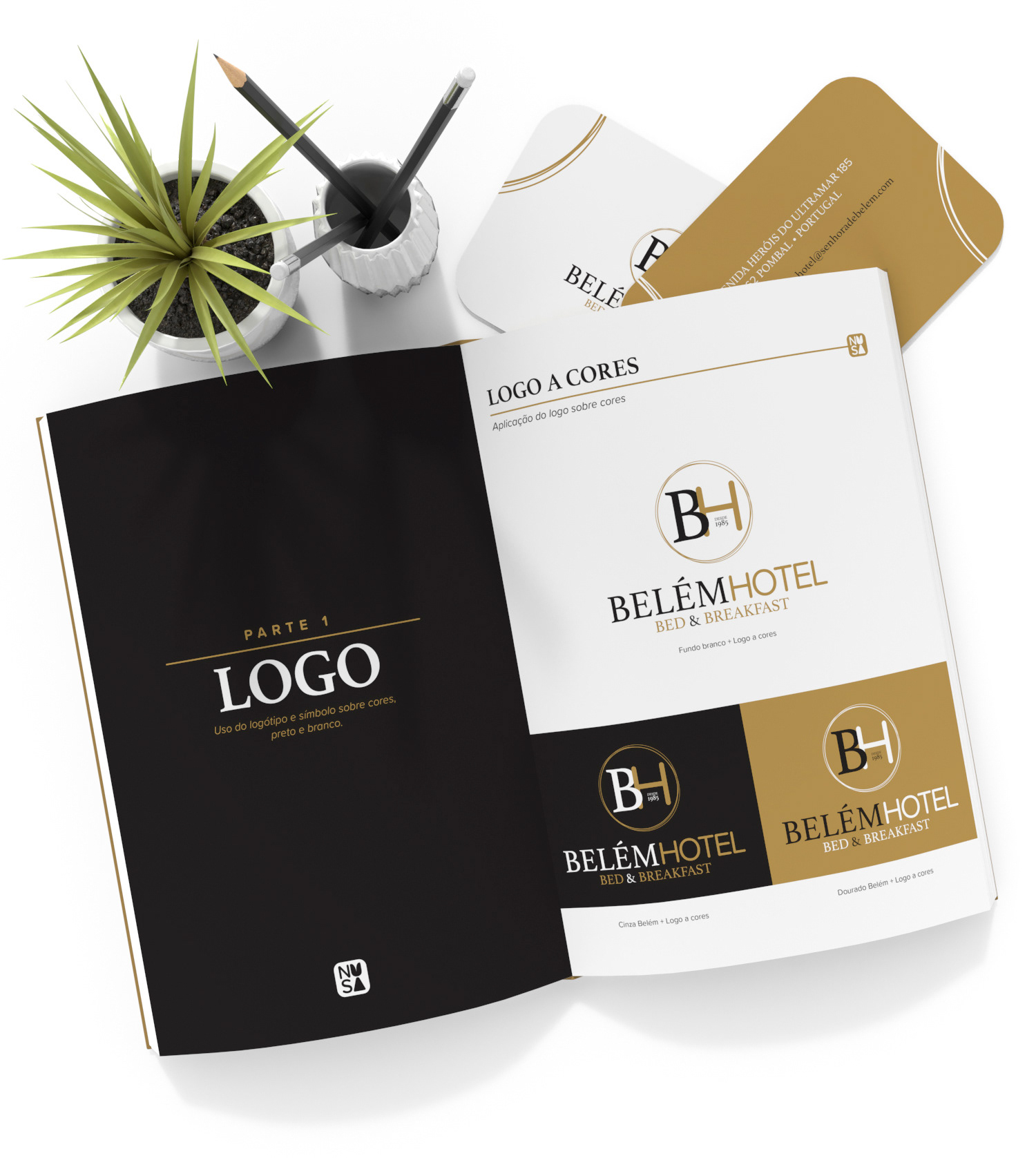


Logo rebrand + Business Cards + Card Holder + Brand Book. Our client asked us to rebrand the old logo and turn it into a modern dynamic feel with a vintage touch, and here it is! Serif type to give it the good old vintage touch mixed with the serif type and circular elements to give it a modern dynamic feeling to it. The proximity between the B and the H was to transmit the familiar feeling with which clients are welcomed to Belém Hotel. This was a lovely project to do! Thank you!